|
Greater San Francisco and Sacramento California cold season multiday extreme rainfall events |
|
3-day rainfall events have been ranked based on the magnitude of the maximum rainfall at any grid point in the area enclosed by the red box on Figure 1. The precipitation data used for ranking was the CDC .25 x .25 degree longitude U.S. grid. According to the CDC documentation of the data, the dataset was derived from 3 sources: “NOAA's National Climate Data Center (NCDC) daily co-op stations (1948-...), CPC dataset (River Forecast Centers data + 1st order stations - 1992-...), and daily accumulations from hourly precipitation dataset (1948-...). Nationally, there are about 13000 station reports each day for 1992-..., and about 8000 reports before that yielding about 3x the reports of any existing historic and operational analyses as of 2000. The data were QC-ed to eliminate duplicates and overlapping stations, and standard deviation and buddy checks were applied..”
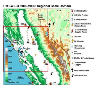
The area was chosen to investigate was based on trying to identify the rainfall events that would, if they occurred today, have the biggest impact on the high population areas around San Francisco and Sacramento. The area also was chosen because it includes the area being studied during the Hydrometeorological Test Bed West field experiment. |
|
The ranking identifies the most significant cool-season rainfall events and major floods since 1948 but the ranking does not always coincide with which events produced the greatest run-off. Also, the resolution of the data is coarse which sometimes results in the analysis missing significant small scale maxima so the precipitation maximum listed for each event probably underplays the maximum precipitation during most events. Three-day total precipitation analyses are provided along with selected 24-hour daily precipitation during the heaviest period. |
|
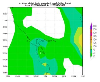
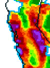
For the more recent years where other data is available, the higher resolution analyses are provided for the 24 hour periods of heaviest rainfall. Occasionally, the differences can be marked. Users are encouraged to compare the other high and low resolution analyses to get a feel for the typical differences between the two. Note the differences in the precipitation observed north of San Francisco between the two image below
|
|
24-hour .25 x .25 precipitation analysis ending 1200 UCT 09 Nov. 2002 (in mm) |
|
24-hr CDC 12.2 km RFC precipitation analysis ending 1200 UTC 09 Dec. 2002 (in mm) |
|
For each event one or two 4-panel charts will be shown. For those looking for additional of these 4-panel charts see http://www.hpc.ncep.noaa.gov/ncepreanal/ |

|
The top left-panel of these charts depicts the 250-hPa heights and isotach analysis, the top right-panel displays the 500-hPa height analysis and normalized 500-hPa height anomaly field, the left bottom-panel provides the 850-hPa height analysis and the normalized anomaly of the 850-hPa temperature and the bottom right-panel shows the 1000-hPa height analysis and the normalized precipitation analysis. The large area maps are provided so forecasters can the synoptic pattern associated with the extreme precipitation event with the pattern being forecast by the operational models or ensemble forecast system. In addition to the large area maps that are posted for each event, selected smaller area anomaly maps are posted, usually of the normalized PW and 850 moisture flux anomalies. For the selected times, additional anomaly maps are also available for selected times at http://eyewall.met.psu.edu/rich/CaliforniaRain/images/. Eventually, we hope to develop a method for objectively identifying the closest matches to anomaly patterns so forecasters can look at them to see how closely they match the current operational forecast fields. |
|
The normalized departure of any meteorological variable can be defined by
N=(X-m)/s
where X is the value of the variable (e.g., 500-hPa height, u- and v-component of the 850-hPa wind, or moisture flux, etc), m is the daily mean value (based on 21 day running mean) for that grid point, and s is the standard deviation (based on the 21-day running mean) for each grid point.
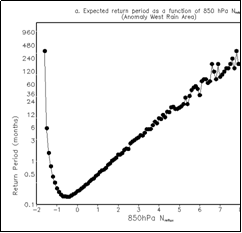
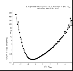
The beauty of using of normalized anomaly is that it provides you with an estimation about how frequently a similar value of the whatever parameter you are looking at is observed. The higher the normalized anomaly the rarer the event is likely to be. Several studies have documented that normalized anomalies provide a way to objectively rank synoptic events (Hart and Grumm 2001) and can help identify significant weather events (Grumm and Hart 2001, Stuart and Grumm 2006, Junker et al. (in press). The two figures below show the return frequency associated with normalized 850-hPa MF (left) and PW (right) anomalies of various magnitudes for a point just off the California coast near San Franciso. Note that a Normalized PW anomaly of 4s has a return frequency of around 24 months but that the rainy season only lasts 6 months which means that the effective return frequency for a similar moisture plume is more like 4 years rather than the two shown on the figure (below left). |

|
The smaller scale maps are also included that show the precipitable water (PW in mm) and its normalized anomaly (see figure above) and display the 850-hPa wind and the normalized anomaly of the 850-hPa moisture flux (MF). These maps are meant to show the anomalous nature of the atmospheric rivers/moisture plumes associated with these events. The also can be compared to forecast normalized PW and moisture flux anomalies for storms being forecast to impact the area. |
|
Normalized anomaly fields of 850-hPa MF and PW are attractive fields to use when trying to anticipate extreme precipitation events where terrain plays a significant role in providing lift. Ralph et al. studied 7 floods on the Russian River of California and documented that all were associated with atmospheric rivers which contained anomalously high PW and MF. The importance of the pineapple express or atmospheric rivers to the moisture transport associated with heavy orographic rainfall events along the west coast has been documented in a number of studies (Lackmann and Gyakum 1999, Ralph et al 2005, Neiman et al. 2007, Junker et al. 2007). A discussion of the pattern associated with northern California heavy rainfall events is offered here. Scroll down on the page until you get to the section entitled “ Using climatological anomalies as a forecast tool along the west coast.” An example of how you might use normalized anomalies as a forecast tool is also offered in the same training module.
The Neiman et al. and Junker et al. studies found that the strength of the moisture plume that impinges on the coastal or Sierra Nevada ranges of northern California modulates the maximum amount of precipitation that is observed. The Junker et al. study also noted the similarities in the patterns of 500-hPa height, 850-hPa moisture flux and precipitable water and their anomaly fields for 3 extreme multi-day rainfall events.
A number of investigators have noted that forecasters often rely on pattern recognition and three– or four-dimensional conceptual models when attempting to interpret output from numerical models as they are limited in the amount of data that they can assimilate (Morrs and Ralph 2007, Stuart et al 2007,Doswell 1992 and 2004). This heuristic approach and knowledge of the model forecast biases are an integral part of the quantitative forecast process (Funk 1991).
The Second Panel on the Future role of the Human in the Forecast Process emphasized the need to identify the important forecast problem of the day and noted that forecasters needed to be able to indentify anomalous weather Situations (Stuart 2007). Normalized anomaly fields along with pattern recognition and knowledge of model biases have the potential to help identify relatively rare events. |
|
Expected return frequency as a function of 850-hPa MF at a point just upstream from the Sierra Nevada mountains. X-axis is the magnitude of the normalized anomaly, the y-axis is the return frequency in months. |
|
Expected return frequency as a function of PW at a point just upstream from the Sierra Nevada mountains. X-axis is the magnitude of the normalized anomaly, the y-axis is the return frequency in months. The dotted lines highlight the return frequency of a normalized anomaly with a magnitude of 4 and shows the expected return period of 24 months. |